Objective: Creative based project that will use previous assets as the raw materials for the final digital preparation of a menu for a Japanese restaurant.
Background: A new far-east fusion restaurant plans to open a new location in the Entertainment district and requires a new menu design. The great artist Shigeo Fukuda's bold and unique poster design is the cornerstone of Hai restaurant art direction and at many level the culture of walking in the door. Elements of WW2 propaganda poster design should also add lightweight influences for the design style. The patrons of the Hai -restaurant is the very top level of the Professional ecosystem. Life-time Business deals are made based on an evening at Hai restaurant. The high level of quality ingredient and expert craftsmanship sets the Hai light-years beyond any experience. We expect the same level of detail for the creative,design, deployment and execution for the menu design.
Ideation and Discovery: Here is my mind map and research materials. I have also included my soya sauce background created last semester.


Here are some Japanese Ink Paintings I found that I used for inspiration.


Here are some poster artwork created by the artist Shigeo Fukuda. His artwork is the main cornerstone for the design and feel for the restaurant and menu design. I will explain how my menu design captures the essence of his artwork.


Our design also had to have some lightweight WW2 propaganda poster design influence. I will also explain how my design incorporates this influence.
 |
| Mindmap |
 |
| Before the logo was provided for us, I had already created a few logo designs and decided that I was going to use these, since the logo I created already matched my design for the final menu. |
 |
| My original soy sauce painting. |
 |
| Here is my final background for the menu. After looking at the work of Shigeo Fukuda, I must admit that I was finding it difficult to create the menu in his style. The problem I was having was incorporating my soy sauce painting with other images. After several hours of manipulating tons of images, I decided that I should just play around with the assets I already have. So I started manipulating my soy sauce painting in different ways to capture his style. A few things I noticed about his artwork is that his designs are simple and bold. He uses a lot of contrast in his work. After doing some research I found out that he was known for creating optical illusions, and by the looks of his work, it seemed like it had a lot to do with positive and negative space, and combining objects. So after playing around, I ended up with the background above. I took one element of my painting (the half ninja star) and decided to create a pattern background. I used bold colors (red and black) as he did in his work. If you look at the negative space, it forms another patterned image. Not so much an optical illusion but to someone who has not seen my original painting, it makes them wonder which pattern is drawn and which is the negative space. I believe I have captured the essence of his artwork in my background. |
 |
| Here is my color palette and fonts that I used. I chose the red to relate it to Japan (flag). The fonts I chose were Impact and Calibri. I chose them to incorporate the light influence of WW2 propaganda posters. By looking at the posters, I noticed they all had one thing in common: their typefaces. Almost every poster had sans-serif fonts, very clean and bold. So I chose Impact because that's exactly what the font does. I then chose Calibri to follow the style of the posters. |
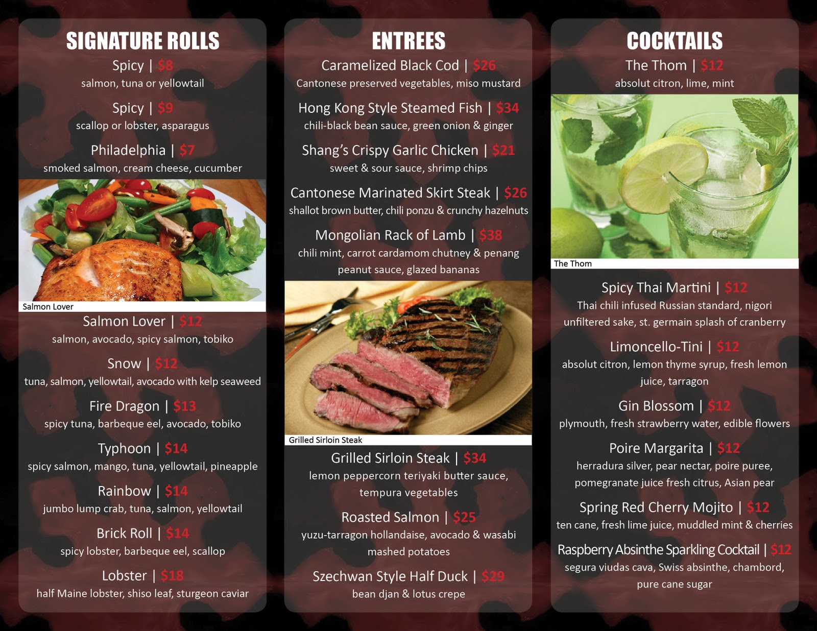
Production: Finally, the final product. Below are a series of images that show the final menu. I decided to do a three column back and front menu, as there were not too many menu items and it gave the text some room to breathe. The first two images are the full front and back layouts (as would be sent to printer), followed by a series of images as it would be viewed by the customers.
 |
| Final Menu (Outside) |
 |
| Final Menu (Inside) |


Final Menu Outside (Front)


Final Menu Inside (3/4 view)
 |
| Final Menu Inside (Full) |
 |
| Final Menu Outside (Full) |
 |
| Time Sheet |


